The petal-design skill
An agent skill that carries this design system's doctrine - so AI coding agents build, review, and theme Petal UI the way the library intends. Drag each divider. Pairs badged "verbatim eval output" are real eval material, untouched; the rest are labelled doctrine illustrations. Panels are display fixtures - the interactive components live on their own playground pages.
Cold start: fresh Phoenix vs the Petal stack
fresh phx.new → Petal + MCP + skill verbatim eval outputSame settings-page prompt, one attempt each, screenshots untouched. Before: an agent in a just-generated Phoenix 1.8 app - it gets the stock daisyUI look, a different system with different opinions. After: the skill arm in a Petal app. This pair is two screenshots, not one DOM: the two sides are different apps by construction.
▸ The exact prompt both agents received
Build a settings LiveView at /settings: app navbar with the product logo on the left and a theme switcher on the right (System / Light / Dark segmented control); profile section (name, email, avatar); notification toggles; and a billing section with a table of the last 10 invoices (date, amount, status, PDF link) plus a plan card showing seat usage (4 of 5 seats) with a usage progress bar and an upgrade button. Support light and dark mode.
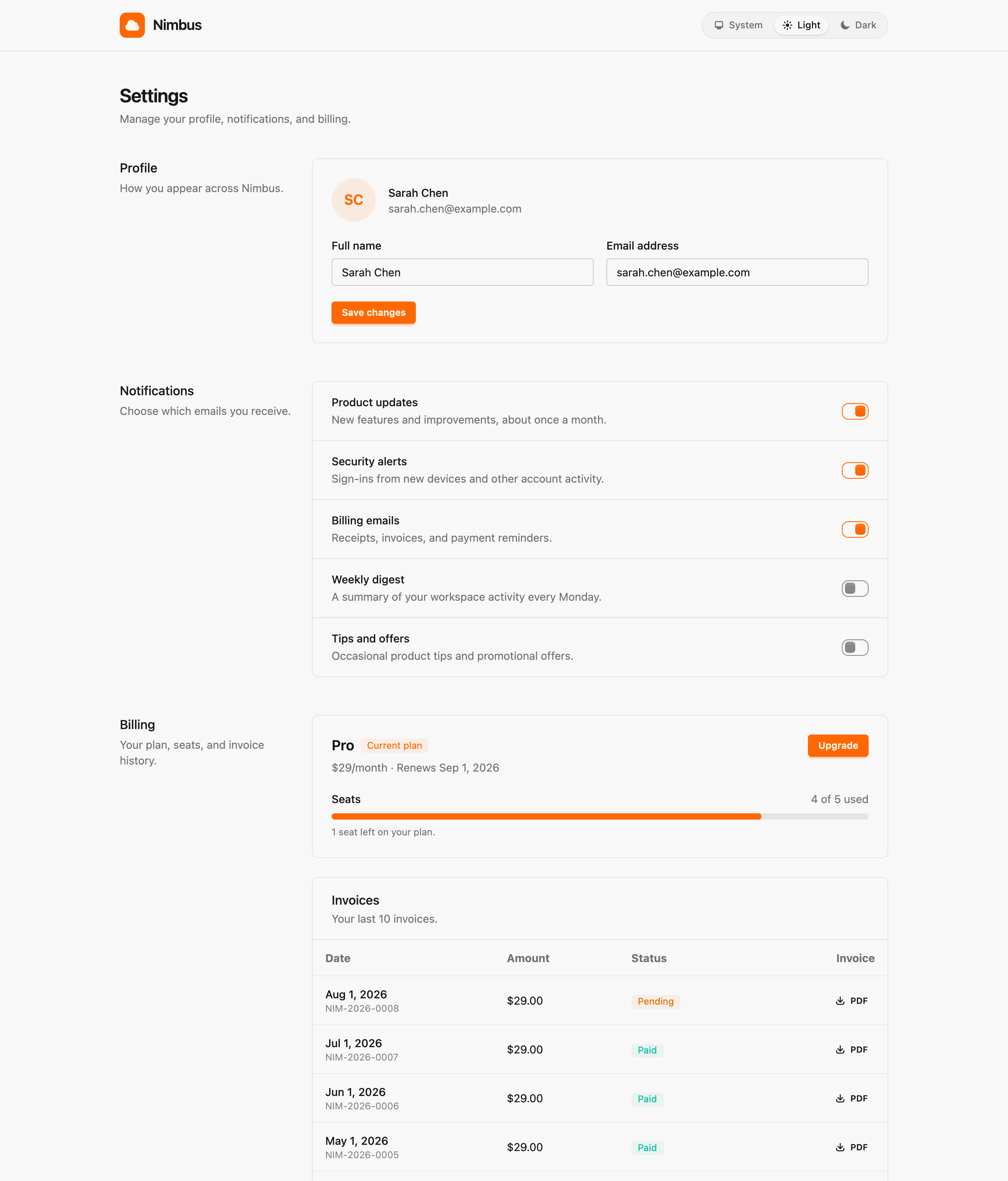
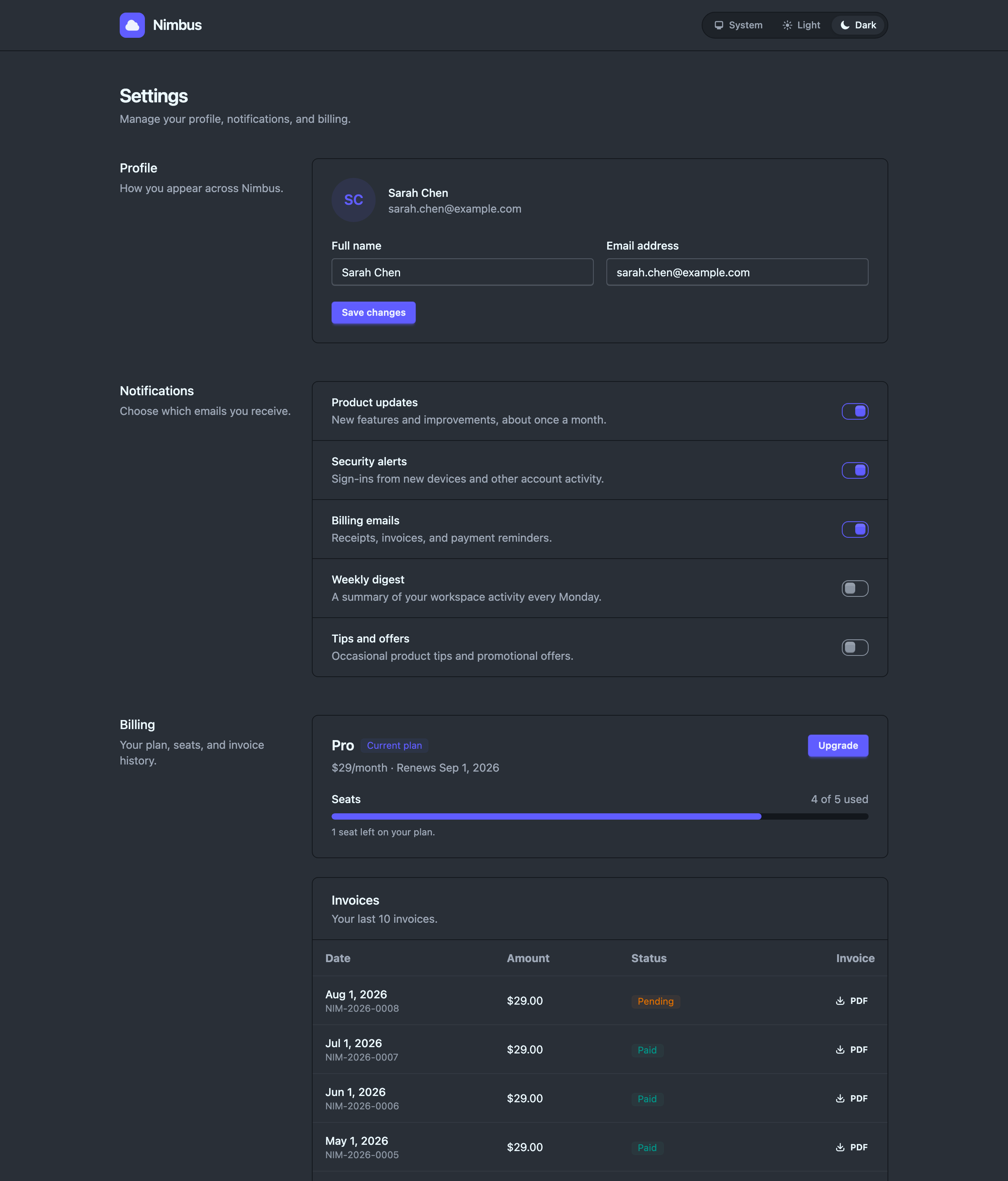 Before
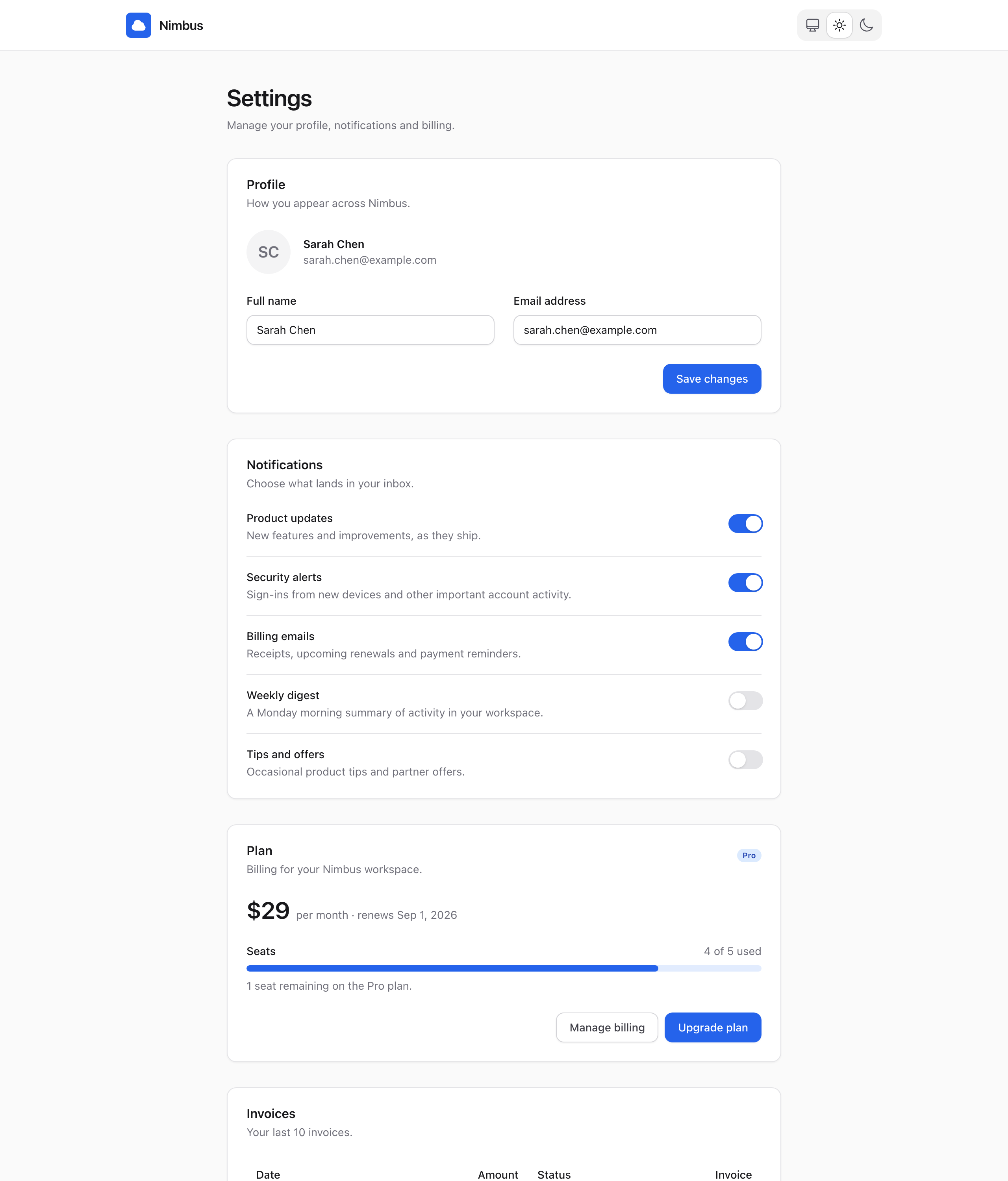
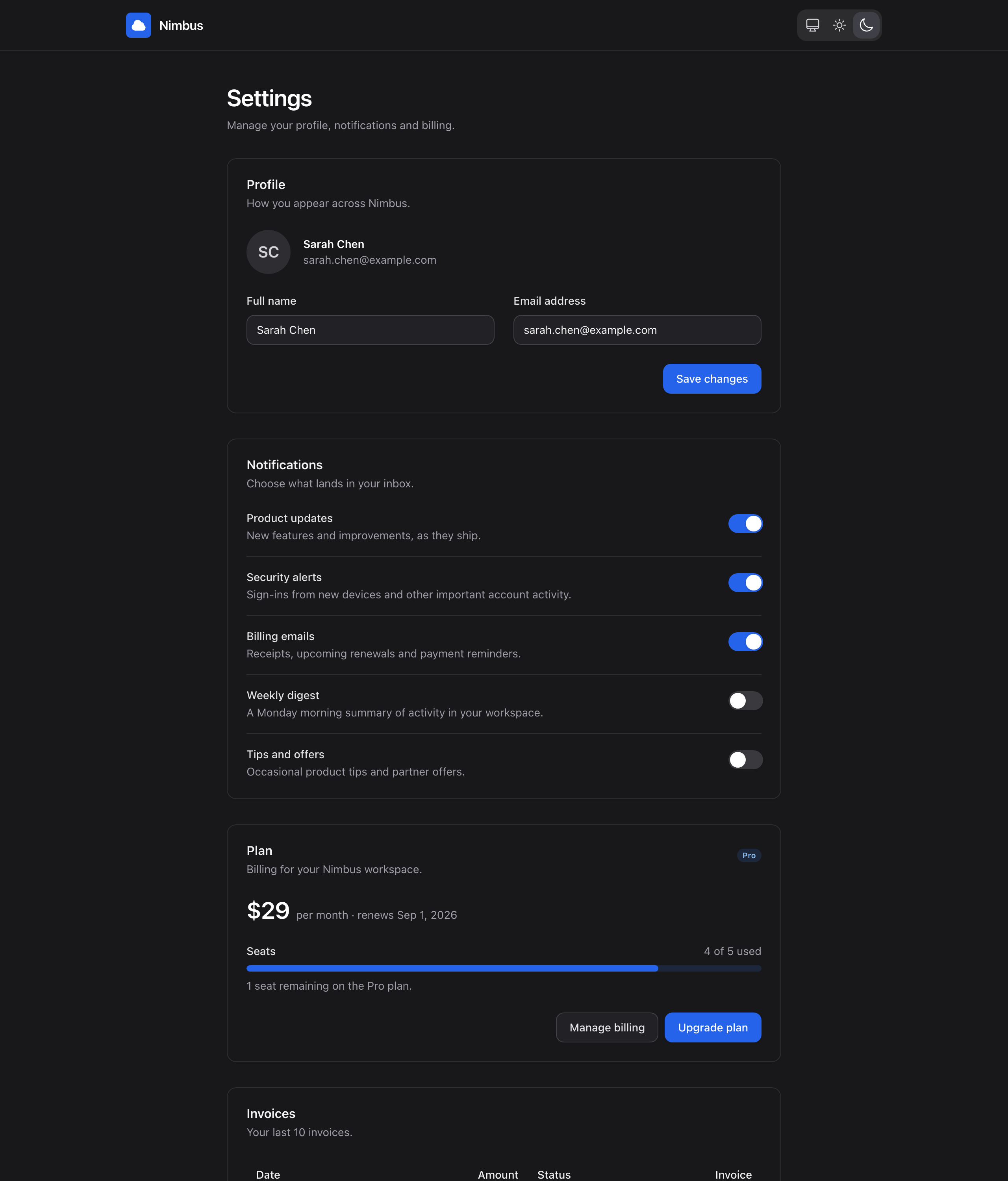 After
After
How it works
The library, the MCP and the skill each cover a different part of what an agent writes.
--pc-radius once and the
shipped components and the hand-written markup move together. Including, right now, this
diagram: it is drawn in the dials above.
How you use it
-
Install once -
claude plugin install petal-design, or copydeps/petal_components/skills/petal-designinto your project's.claude/skills/. - Then just work - the skill triggers itself. Ask your agent to build a page, review a diff, or rebrand, and it loads the right doctrine before writing HEEx. There is no command to remember and no setup interview: Petal ships the design system, so the skill already knows it.
Under the hood
One skill, no command palette: nine markdown files, zero executable code. A request routes by its shape into one of three modes, and each mode loads only the doctrine it needs.
Writes HEEx to the craft floor - components over raw tags, the gray dial, a dark pair on every colour, radius from the one knob.
"Add a billing settings page"
Audits a diff - a written design judgment first, then a 13-row grep table and schema spot-checks, reported as P0-P3 findings.
"Review this diff for design drift"
Rebrands through the token layer - primary ramp, gray remap, the radius knob, the dark ghost material. Never per-element edits.
"Make it warm amber, sharp corners"
Tailwind soup to the system
task fixture → MCP + skill verbatim eval outputTask: convert a hand-rolled invoices view. Before: the fixture - literal zinc palette, raw table, hand-rolled fixed inset-0 modal, hover:opacity on a solid. After: the skill arm's conversion - table, soft badge, and the confirm becomes a real alert_dialog.
Invoices
| Date | Amount | Status |
|---|---|---|
| 2026-08-01 | $29.00 | paid |
| 2026-07-01 | $29.00 | paid |
| 2026-06-01 | $29.00 | paid |
Invoices
| Date | Amount | Status |
|---|---|---|
| 2026-08-01 | $29.00 | paid |
| 2026-07-01 | $29.00 | paid |
| 2026-06-01 | $29.00 | paid |
Theme mode: the same markup, made yours
identical HEEx, dials only doctrine illustrationBoth sides are identical HEEx. The after side sits inside one wrapper carrying the amber primary, the stone gray dial, and --pc-radius: 0 - in an app that is a single @theme block, and the skill's theme mode writes it for you. Retro, corporate, brutalist: the dials do not care.
The polish pass
authored slop → on the system doctrine illustrationThe AI-slop tells the review playbook hunts: kicker caps, italic display serif, side-tab border, off-system cream, hardcoded radius. After: the same content on the system - token surface, house type, one accent.
Your team is almost out of seats.
9 of 10 member seats are in use across two workspaces.
Dark mode: the ghost ladder vs mechanical inversion
MCP-only → MCP + skill verbatim eval outputTask: add dark mode to a light-only card. Before: the MCP-only arm - schema access carries no styling doctrine, so it inverts to opaque gray-800/gray-600. After: the skill arm lands the ghost ladder exactly - dark chrome as alpha-of-gray-400 (/8 surface, /17 hairline, /25 input border), so the ghost carries the gray dial's hue. Both sides render forced-dark on purpose: the task under eval is dark mode, so the playground's theme toggle deliberately does not affect this pair.
API keys
Rotate keys regularly.
API keys
Rotate keys regularly.
skills/eval/demo-script.md in the repo. The skill is
skills/petal-design/ - nine files, no executable code; it routes build,
review, and theme requests and resolves every schema through the MCP ladder.